Design Patterns: Gutenberg, F, Z
People don’t read web pages like books. They scan. These patterns help you place important content where attention naturally goes.
The way a website looks follows from its purpose. Its goals always should be reflected on its structure and content. Researchers were always interested in how to increase the amount of people visiting a website, especially those who do a target action - register or place an order. The main idea behind increasing the visitor/buyer conversion rate is making the whole path easier and faster. It will increase the efficiency of the website and will help you make loyal customers which will return again and again.
The major part of your visitors interact in a similar way because they have alike skills of working with information which they have learned throughout life: reading, searching information in texts, watching pictures in books. These basics skills are taught from the childhood, and are almost impossible to change. That is why it needs to be taken into account when designing a product.
There are many ways on how to improve customer experience on the website and one of them is organising elements on the page on a proper way. We will consider three design concepts, or patterns. Which one to choose - depends on your page structure and its specifics.
GUTENBERG DIAGRAM (DIAGONAL ATTENTION)
When a user observes a page, his eyes always repeat the same movements from top-left to bottom-right. He pays more attention to the areas on this diagonal (top-left and bottom-right) than other areas. In its turn, the top-right area gets more attention than the bottom-left.
Use it for:
- simple landing pages
- pages with a clear call-to-action
F-PATTERN (TEXT SCANNING)
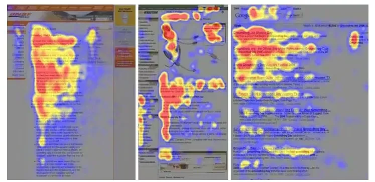
When researchers investigated how users scan content with eyes, the resulting heat maps were looking similar to the F letter. Users eyes pay more attention in the beginning of the page checking all the content till the right boundary, then moves down and does not get a bit till the end of the line and so on.
- first line gets most attention
- attention drops as they go down
- left side is read more than the right
Use it for:
- blog posts
- lists
- long content
Z-PATTERN (SIMPLE LAYOUTS)
This is a natural movement for people reading from the left to the right. Eyes start from the beginning of the line and then move on the right. At the end of the line they move to the next line beginning by diagonal and start a new cycle. Overall the path looks like the letter Z. There are also several types of this patters which will be considered in this article.
Use it when:
- the layout is simple
- you want to guide attention with a few elements
Now review more clearly.
GUTENBERG DIAGRAM
The Gutenberg Diagram is a well known common pattern of observing information. If we divide the screen to 4 equal areas and analyse how a person eyes move across them, we will note that each area gets different attention.
- Primary area. The high-left part of screen gets most of the user attention automatically once the page is opened. It should contain the most important information: logotype, a unique offer. It will help to attract user attention to the company and its product.
- Well investigated secondary area. Following the natural reading skill, the user moves to the next area, but pays less attention. Some additional statements may be placed here. If you put here a call to action button, then chances are big that the user journey on the screen will end. It is a good place for a phone number, callback form etc. Due to so-called 'reading gravity' while checking this data, eyes move by diagonal towards to the area 4.
- Poorly researched area. This area will be scanned quickly without paying much attention. Do not place here anything important, otherwise it will not be taken into account.
- Terminal area. Finally user gets into the bottom-right area and stops before deciding the next move. This is a good spot to place the call to action button, link, or anything that requires user attention.
This pattern works in most cases no matter what content is there: a book page, website, mobile application etc. Understanding it will help place important content in the areas that get most attention, and chances that user performs target action are higher. It is the most universal pattern to design digital products and modern websites.
F-PATTERN
In the middle of 2000 Jacob Nielsen suggested investigating how users look through content using eye tracking technologies. During the research a heat map was created and it showed that most people scan content following the path in a similar way to the letter F.
Note that the F pattern does not contradict to the Gutenberg Diagram, but complement it. The Diagram demonstrates user path across the content placed on one screen (text, images, videos, buttons), while the F-pattern describes interaction with a large amount of mostly text containing several "screens" (an article, search results).
What makes F-Pattern looking like F letter - is the loss of attention while moving down. If in the beginning of the page user checks most of the information (horizontal row is larger), in the end he only quickly scans content. The lower - the shorter are the horizontal lines.
That is why the most important information should be in the top of the page where it will be read completely. Less important information should be placed below and along the left edge where the eyes move mostly vertically and less horizontally. May be some lists should be there.
Also divide the heavy text content to titled sections so users may catch an eye on that and find the needed content faster. And also remember, if the content is interesting to someone - that will be read even if placed outside the F-shape, so these areas may be used for specific additional information.
Z-PATTERN
Alike the F-pattern, the Z-pattern follows the shape of the letter Z. The eye moves similar to that letter. First along the horizontal line, then by diagonal to the beginning of the next line and then till the end of the line. Of course the movements naturally are not so sharp, that is why sometimes this pattern is also called 'reversed S pattern'.
Z-pattern differs from the Gutenberg Diagram that the users should follow the horizontal lines till the end through the "weak" areas 2 and 3. It makes sense for plain designs where are only a few important elements which require attention.
This patters is also used in content writing where some extended versions of this concept are used:
- The Zigzag-Pattern. The Z-Pattern can be repeated multiple times, and it reflects how we naturally read big amounts of plain text.
- The Golden Triangle. This is a special case of Z-Pattern. The viewer's eyes move along the horizontal line to the right, then by diagonal to the bottom left and return to the initial position. The triangle should contain the most important information. As we see here in contradict to the Gutenberg Diagram, the bottom-right area is not taken into attention. The Golden Triangle makes sense if that area is empty or does not contain eye catching elements.
CONCLUSION
People's basic interaction with content is based on skills learned in the childhood and therefore lies deep in the subconscious. We should not try to change that behaviour because it is almost impossible, but design content according to the patterns. The closer the content to the pattern - the easier to perceive the information and the higher probability that the visitor will become your client. The patterns described in this post are the typical and most common for the web interfaces and content pages.
Also, remember - patterns describe the behaviour of a new visitor who is not familiar with your product or not very interested in your content. If a person is really interested, then they will read everything no matter of what pattern you were caring of. Make a good product and it is sure that you will get clients.
PRACTICAL TIPS
- Put the main value + CTA in the first screen.
- Use headings and short paragraphs (supports scanning).
- Use visual hierarchy (size, contrast).
- Don’t hide key info in “weak zones”.